YNIQ Eyewear
A premium eyewear brand that felt premium everywhere except online.
The brief
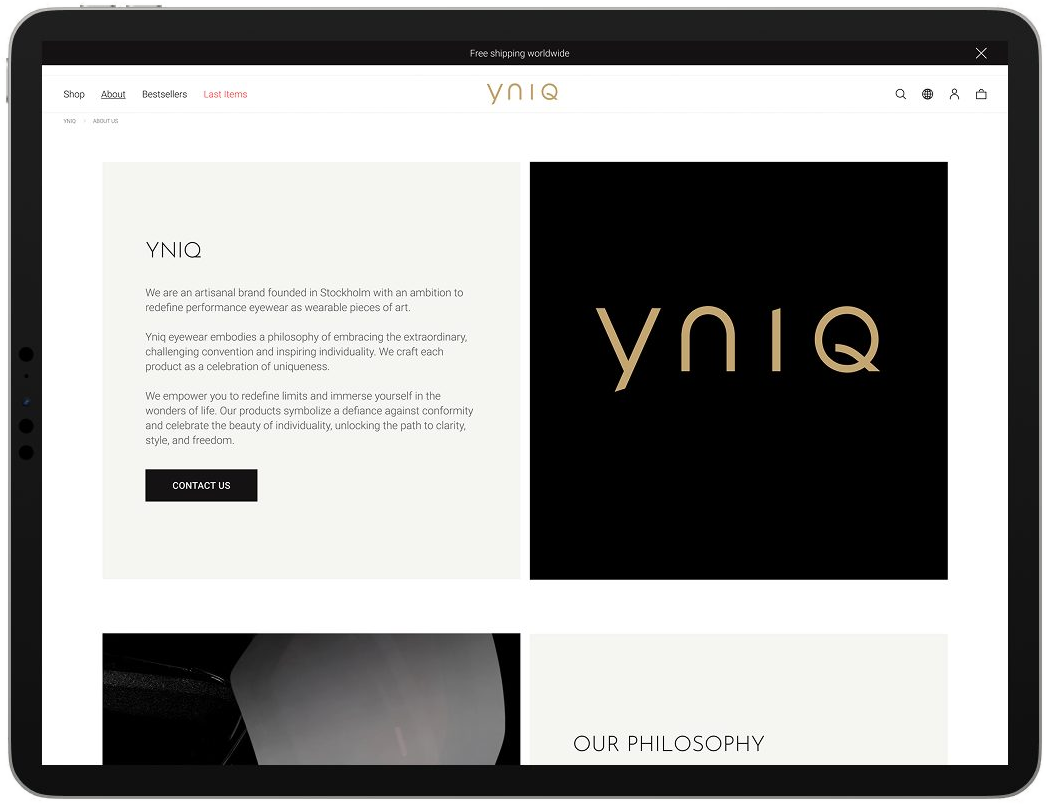
YNIQ makes eyewear you notice across a room. Bold shapes, heavy materials, finishes you want to touch. In their stores that comes across in seconds. Online it disappeared. I redesigned the shop so the product does the selling again.

The challenge
Strong on the shop floor, invisible on the screen.
- 01
The craft got lost.
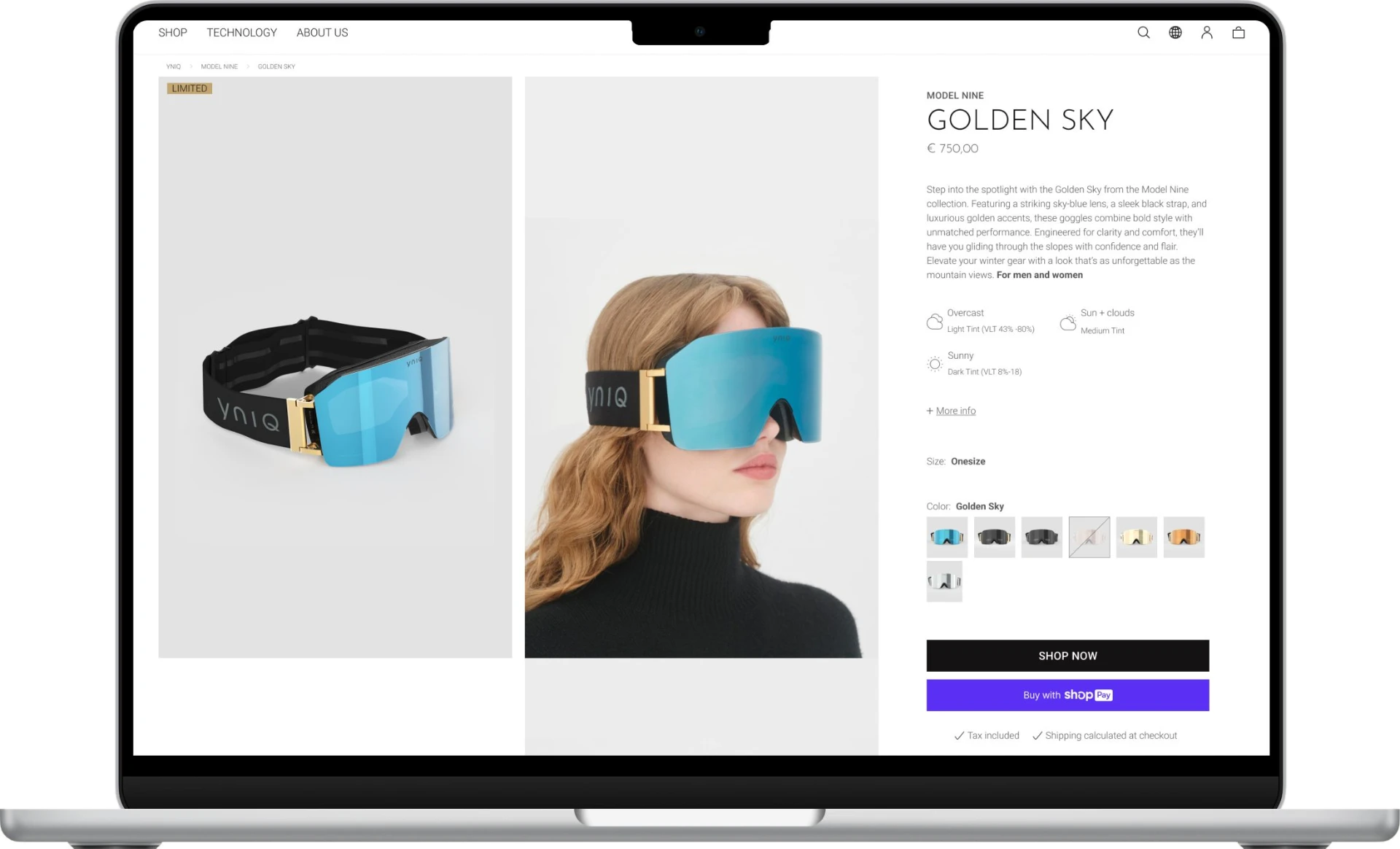
The details that make YNIQ worth the price, the lenses, the frames, the finish, were hard to see online. Small, flat product images did nothing for a brand built on touch.
- 02
Too many ways in.
A crowded menu made people think before they could browse. Every extra choice was a reason to leave.
- 03
A premium price asks for confidence.
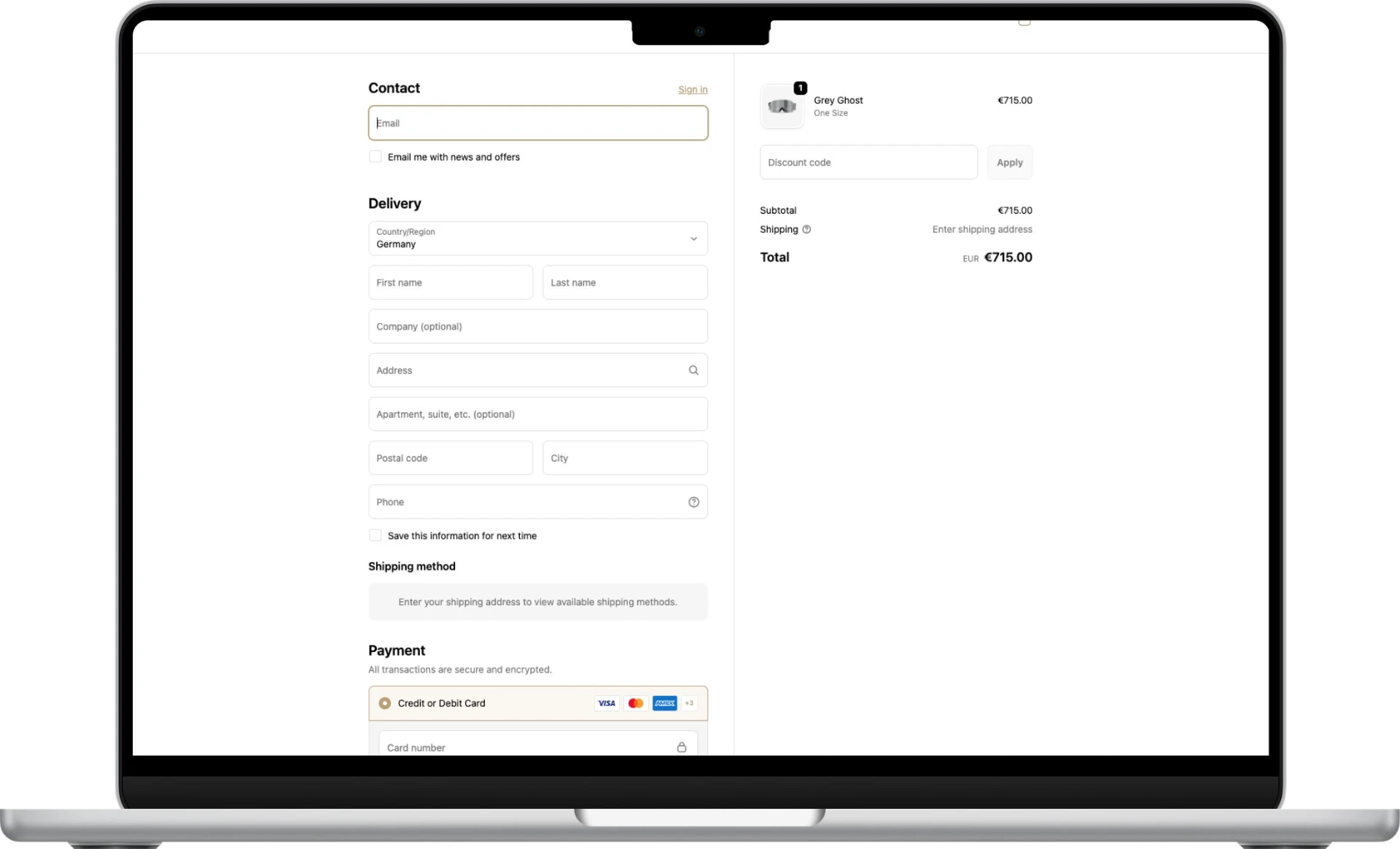
A pair of ski goggles costs €750. At that price, any friction between wanting and buying loses the sale.
Four moves. One question.
Behind every decision
Does this help someone feel sure enough to spend €750 on a pair of goggles?
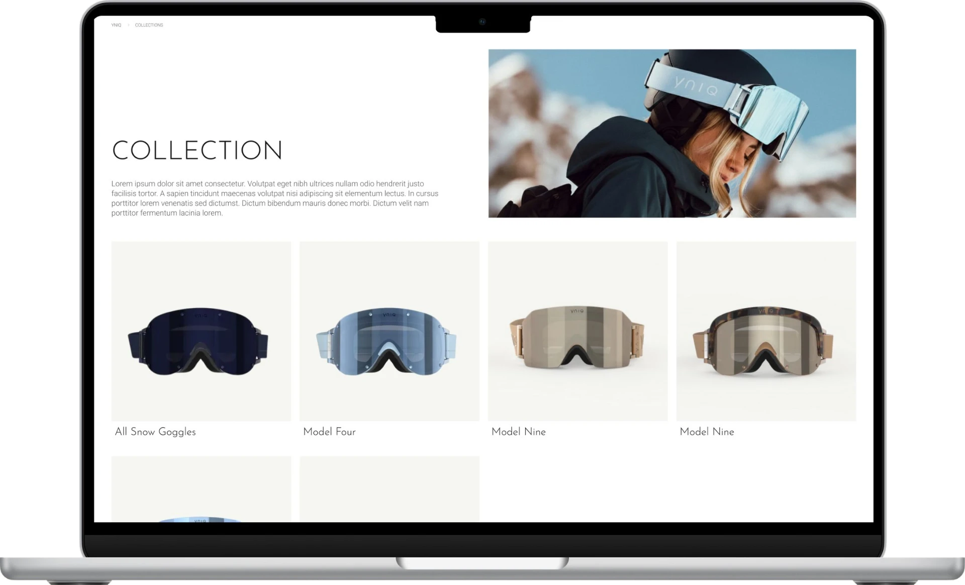
Navigation cut down to three clear paths, so a visitor reaches the right collection in one step.
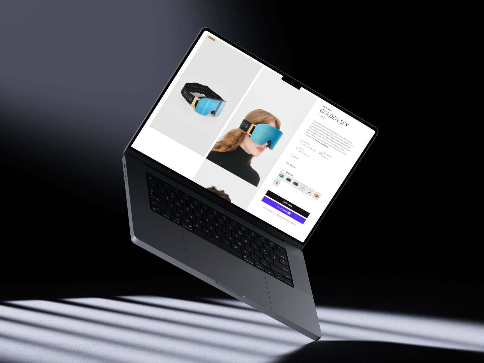
The result
A shop where the product does the talking.
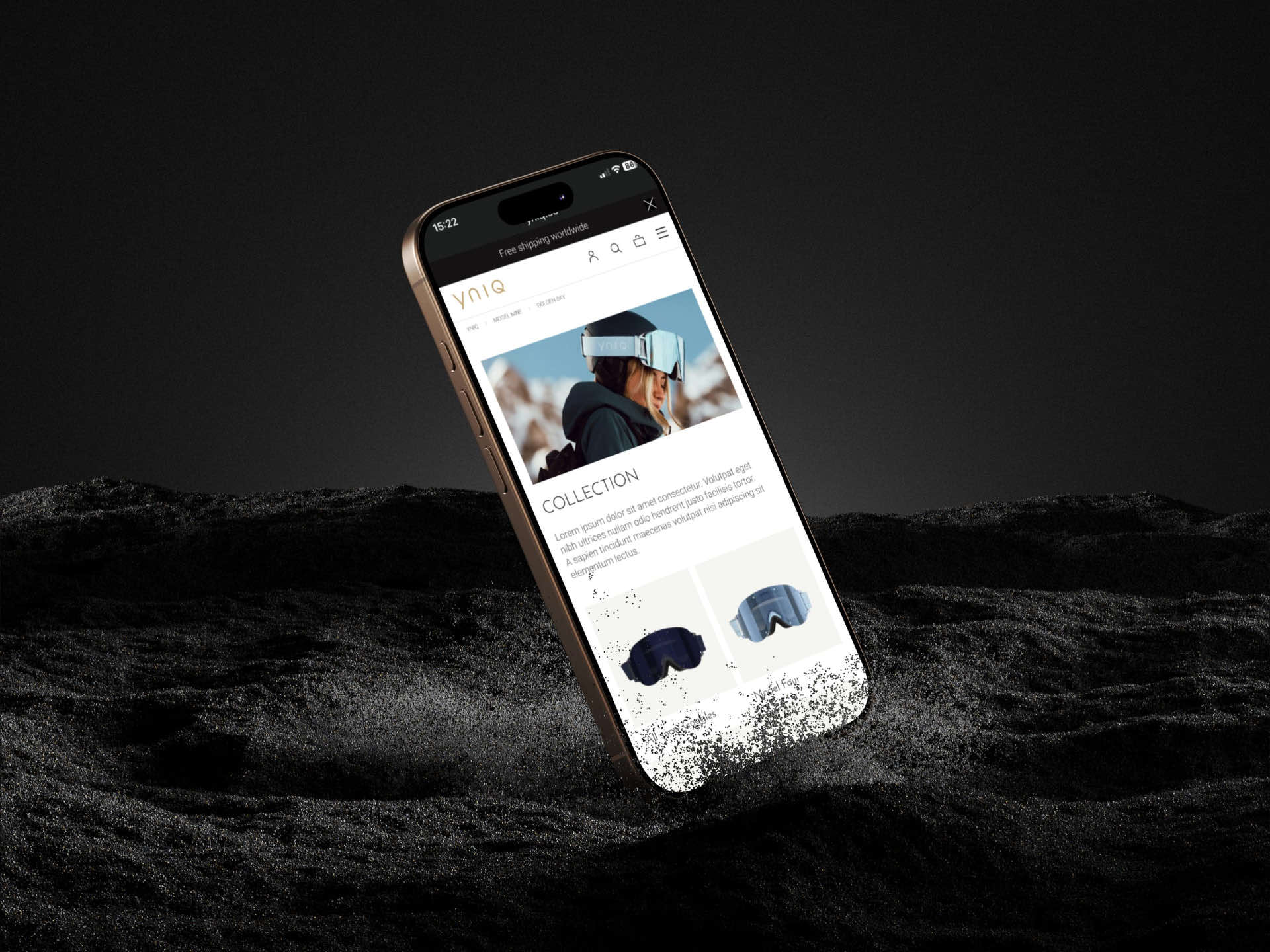
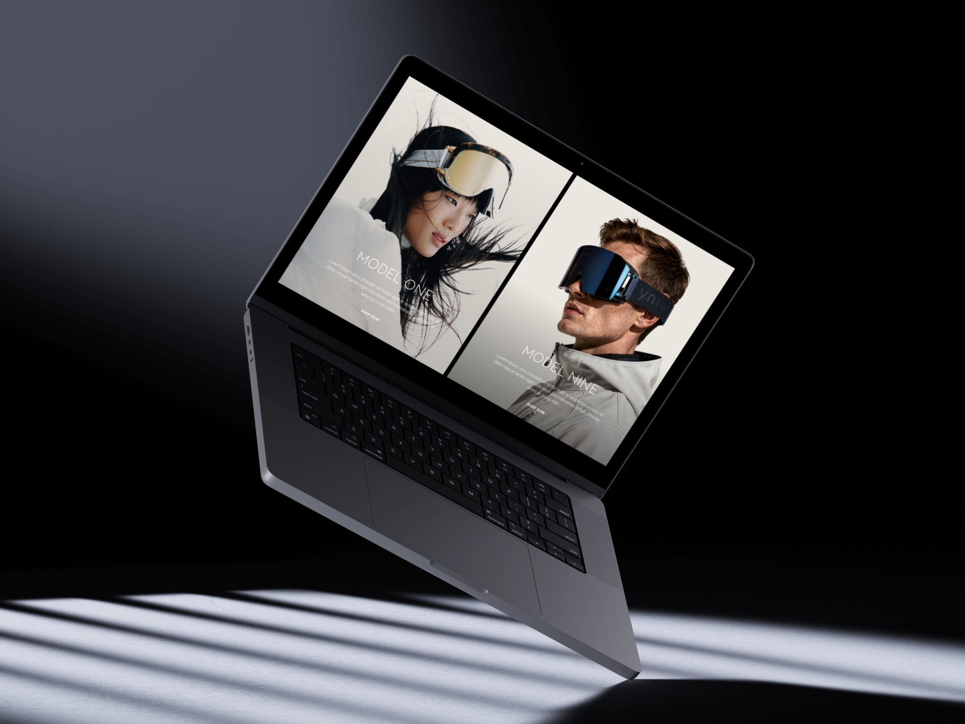
A stripped back e-commerce experience that carries YNIQ's craft from the first collection page to the last click.
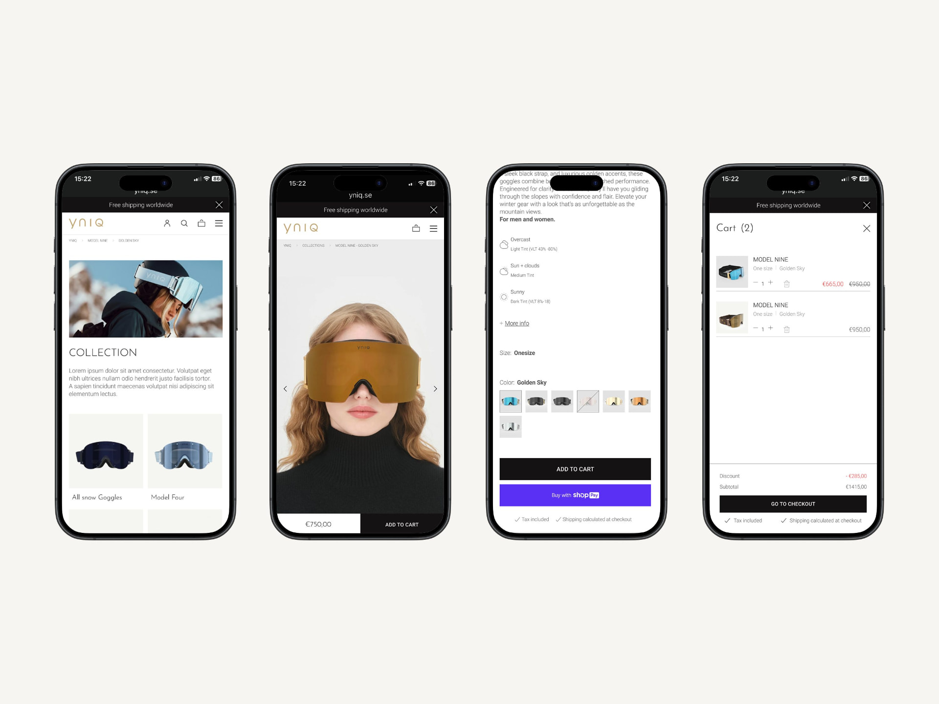
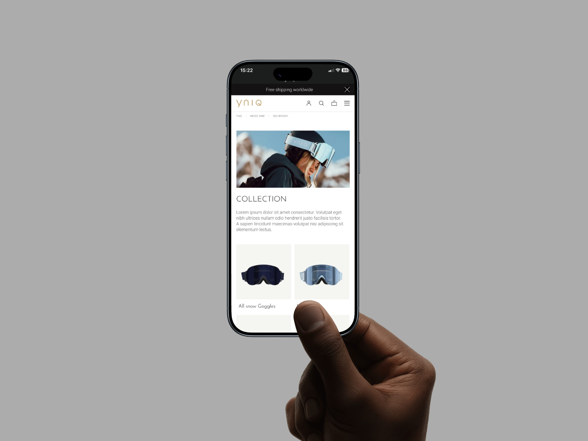
Built for the phone first.
Collection, product and cart designed for the small screen, where most people first meet the brand.