Nordaq
A new website for the Swedish company that serves water filtered on site at Michelin kitchens and luxury hotels.
The brief
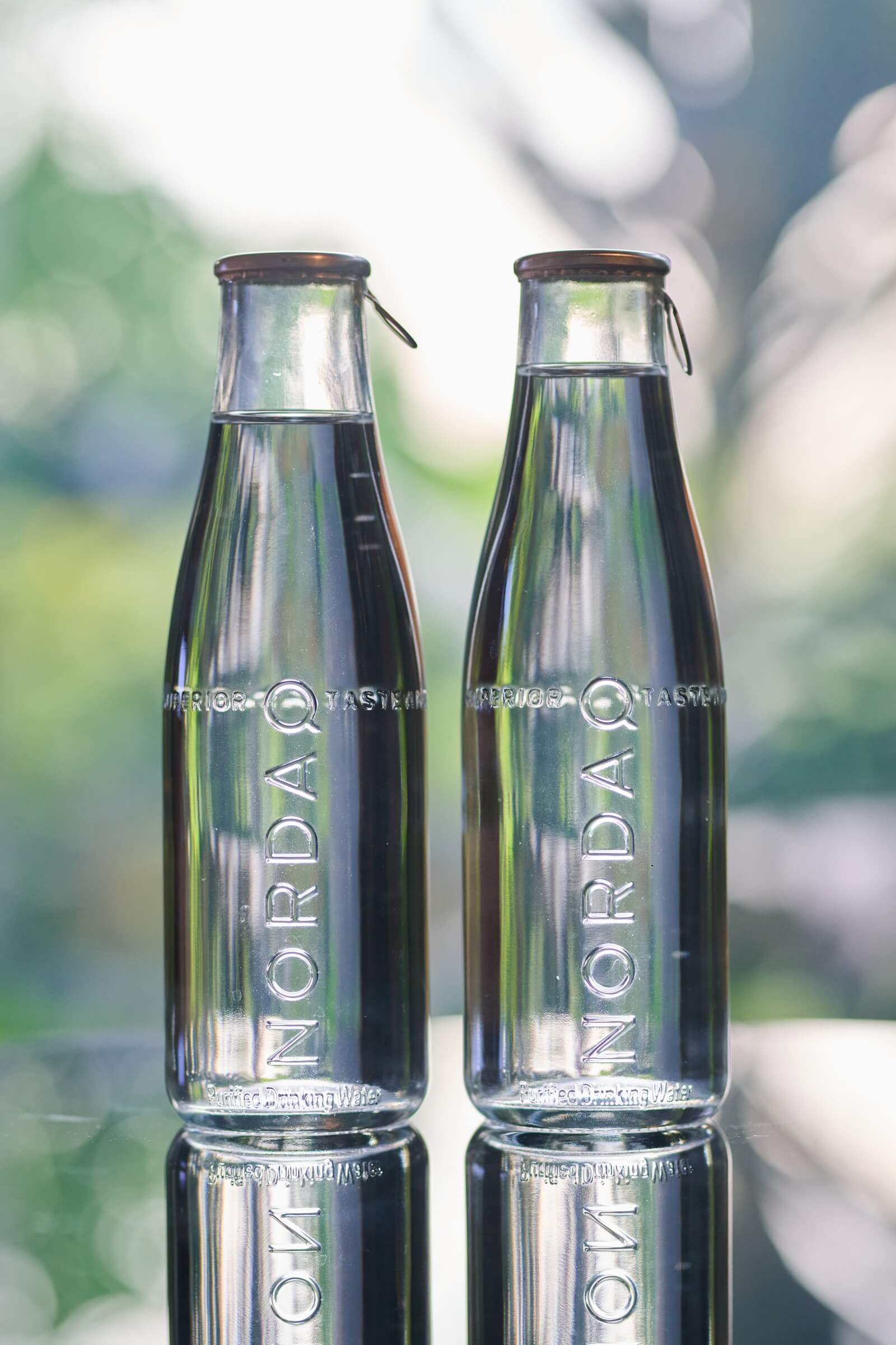
Nordaq started in Stockholm in 2005 with one stubborn idea: stop shipping water across water. Its patented filters turn local tap water into still and sparkling water, bottled on site in glass. More than 280 Michelin starred restaurants and over 700 luxury hotels pour it. The water sat on the best tables in the world, but the website did not look like it belonged there. As a consultant at CC Projects I designed the new one.
The challenge
World class tables, an ordinary website.
- 01
One long sentence.
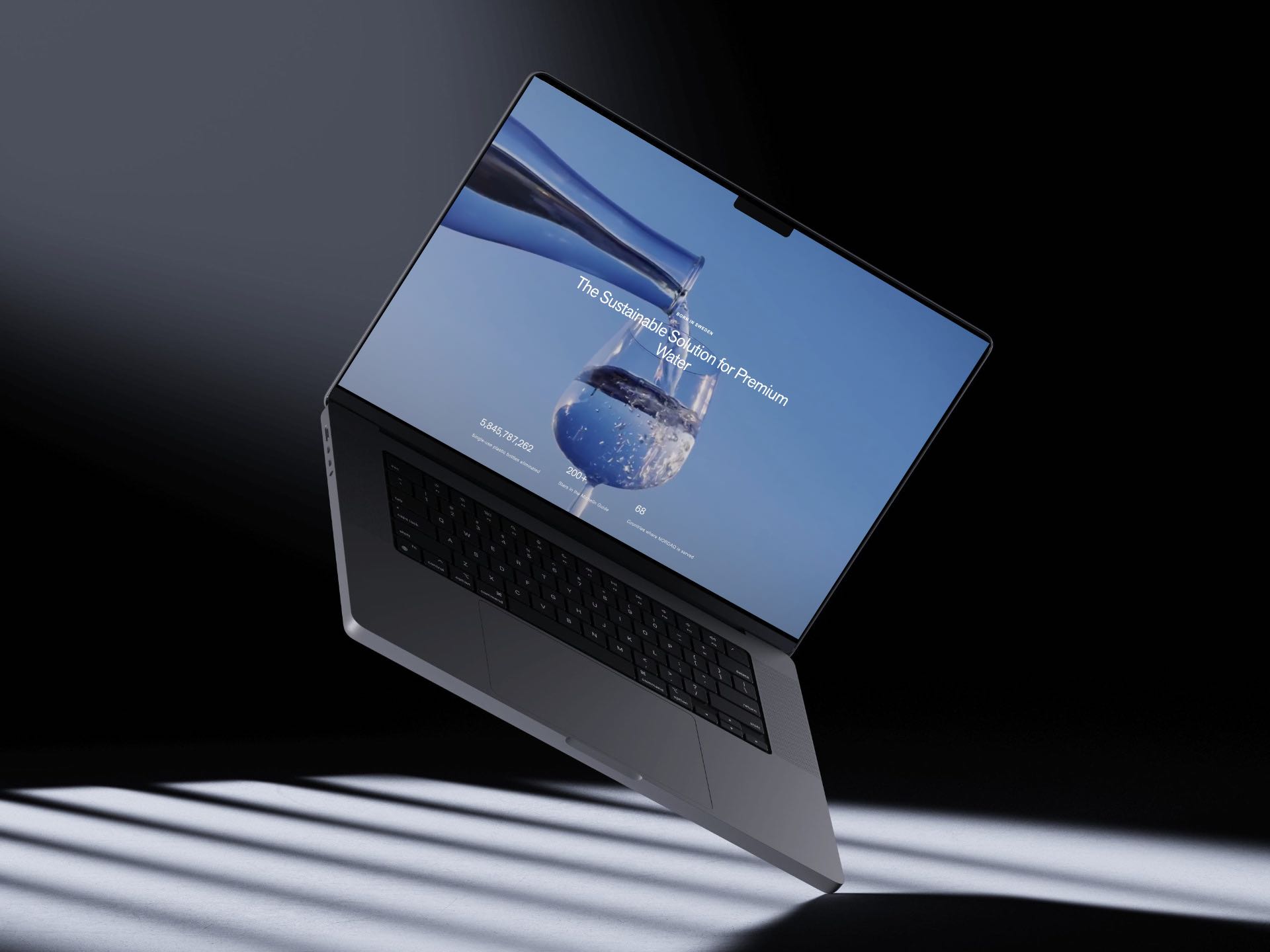
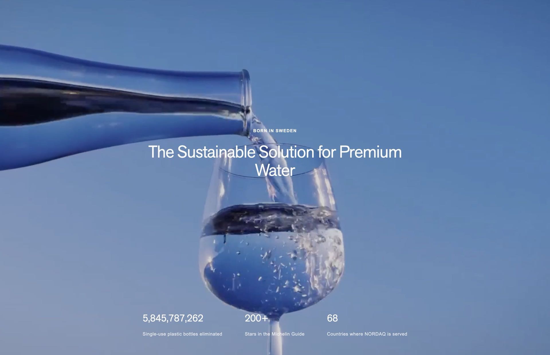
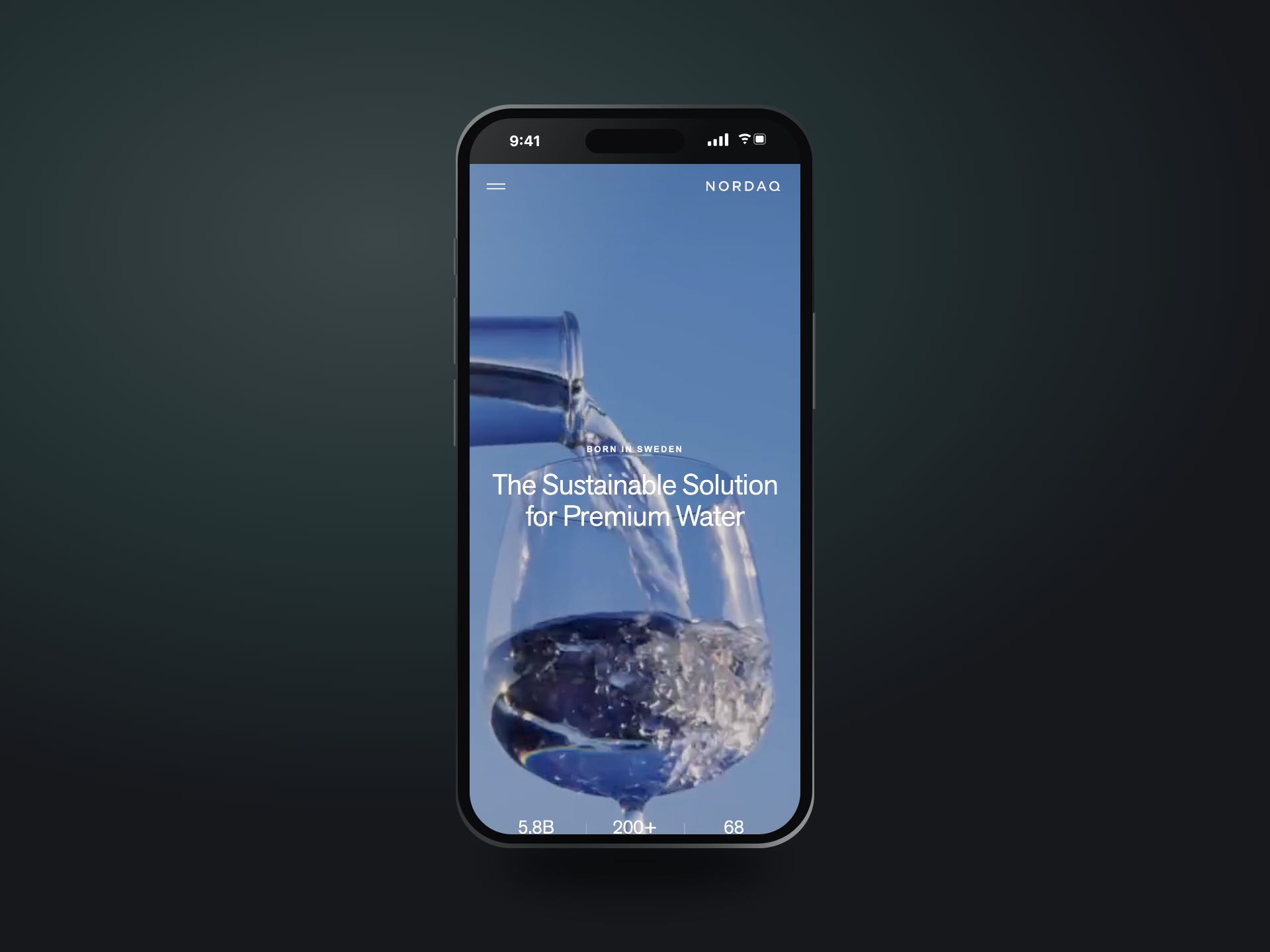
The old hero ran as a single line over the video: "The sustainable solution for premium water... Born in Sweden". The promise and the origin fought for the same space.
- 02
Proof without an order.
Michelin chefs, famous hotels and big numbers were all there, stacked down the page with nothing telling a visitor what mattered first.
- 03
A brand made for slides.
The brand guidelines lived in Canva, built for decks and social posts. They needed to grow up for a screen that scrolls.
- 04
A launch that was close.
The Nordaq team would fill in the content in Storyblok themselves, so every block had to be simple to fill and hard to break.
Three changes you can see.
The test
Does the page pour before it talks?
The run on sentence became two parts. Born in Sweden moved up as a small line, and the promise became the headline, centred over the pour.
The button went, and three numbers count up underneath instead.
The result
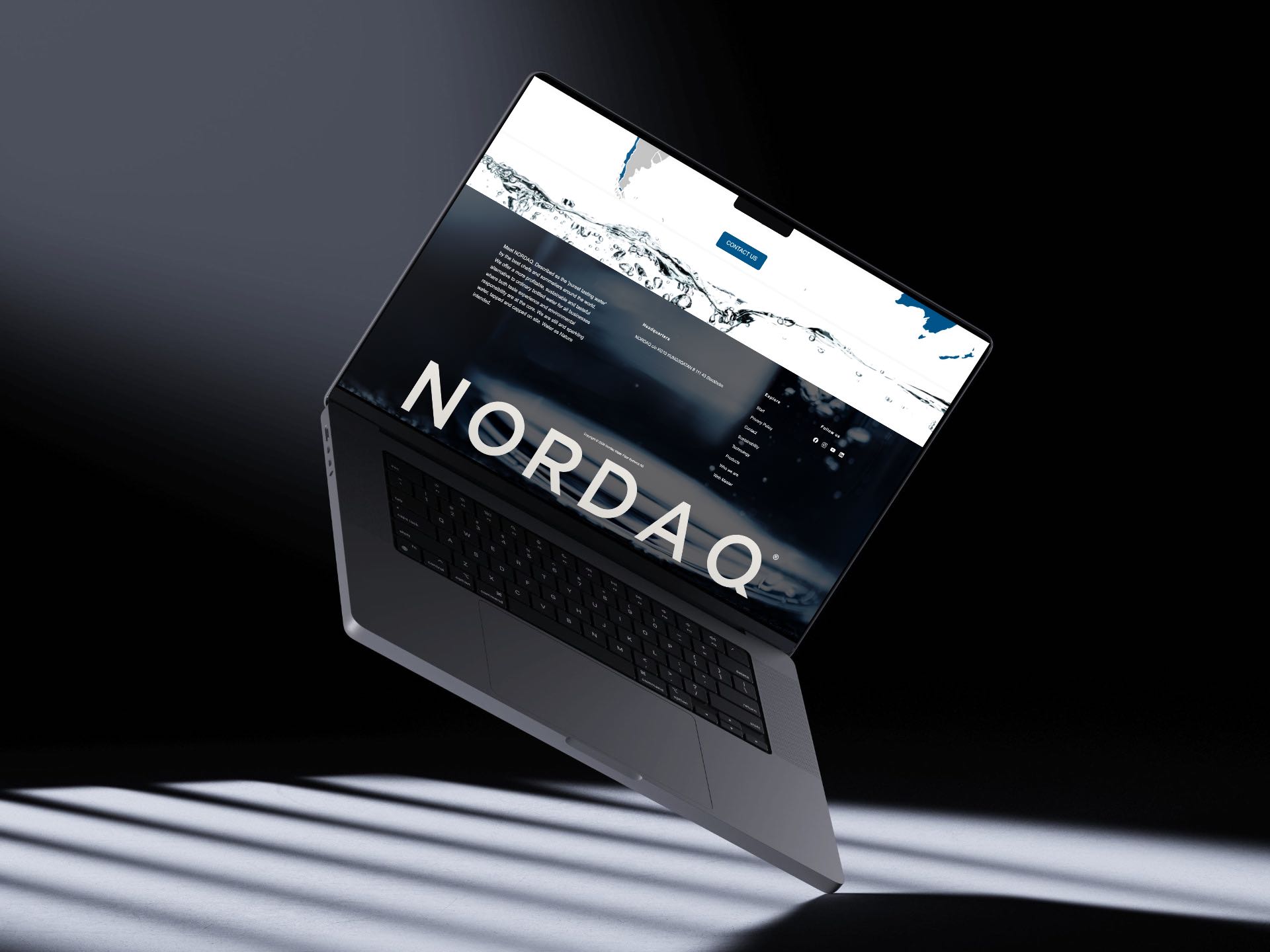
A website that looks like it belongs on the table.
The new nordaq.com went live in the summer of 2026, built by the developers at CC Projects on Next.js and Storyblok.
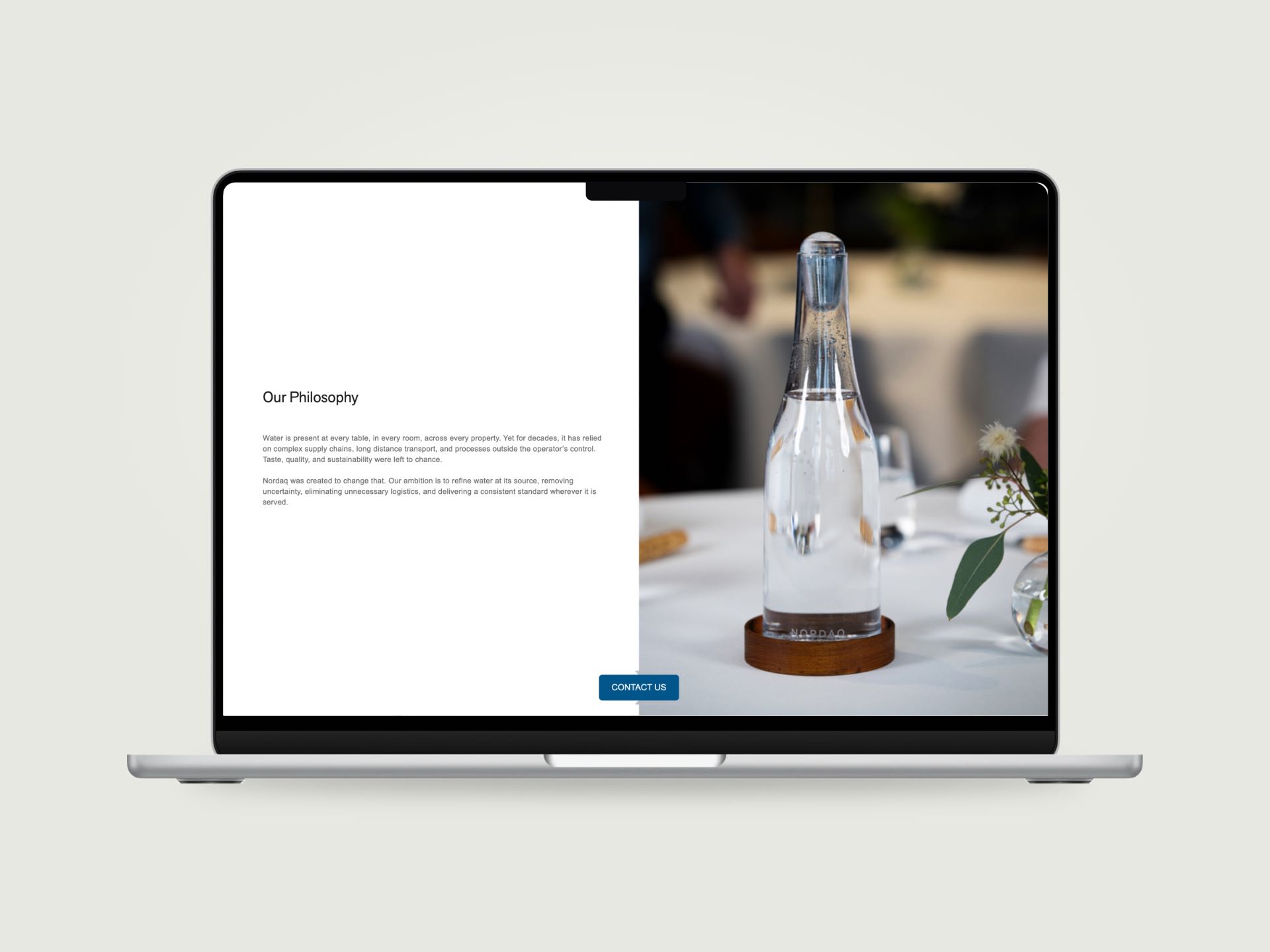
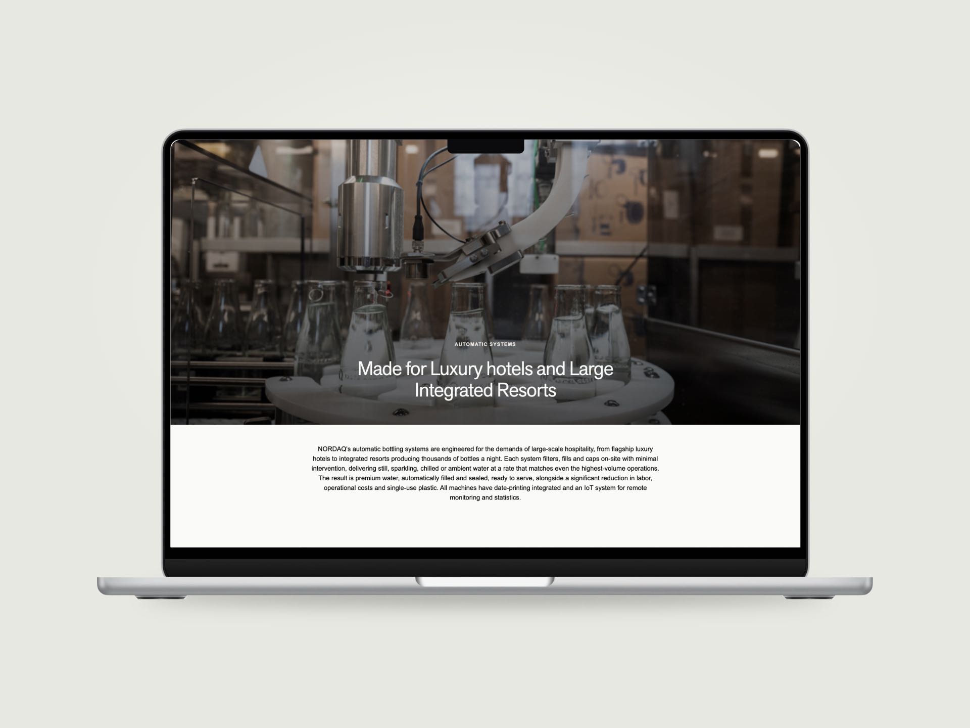
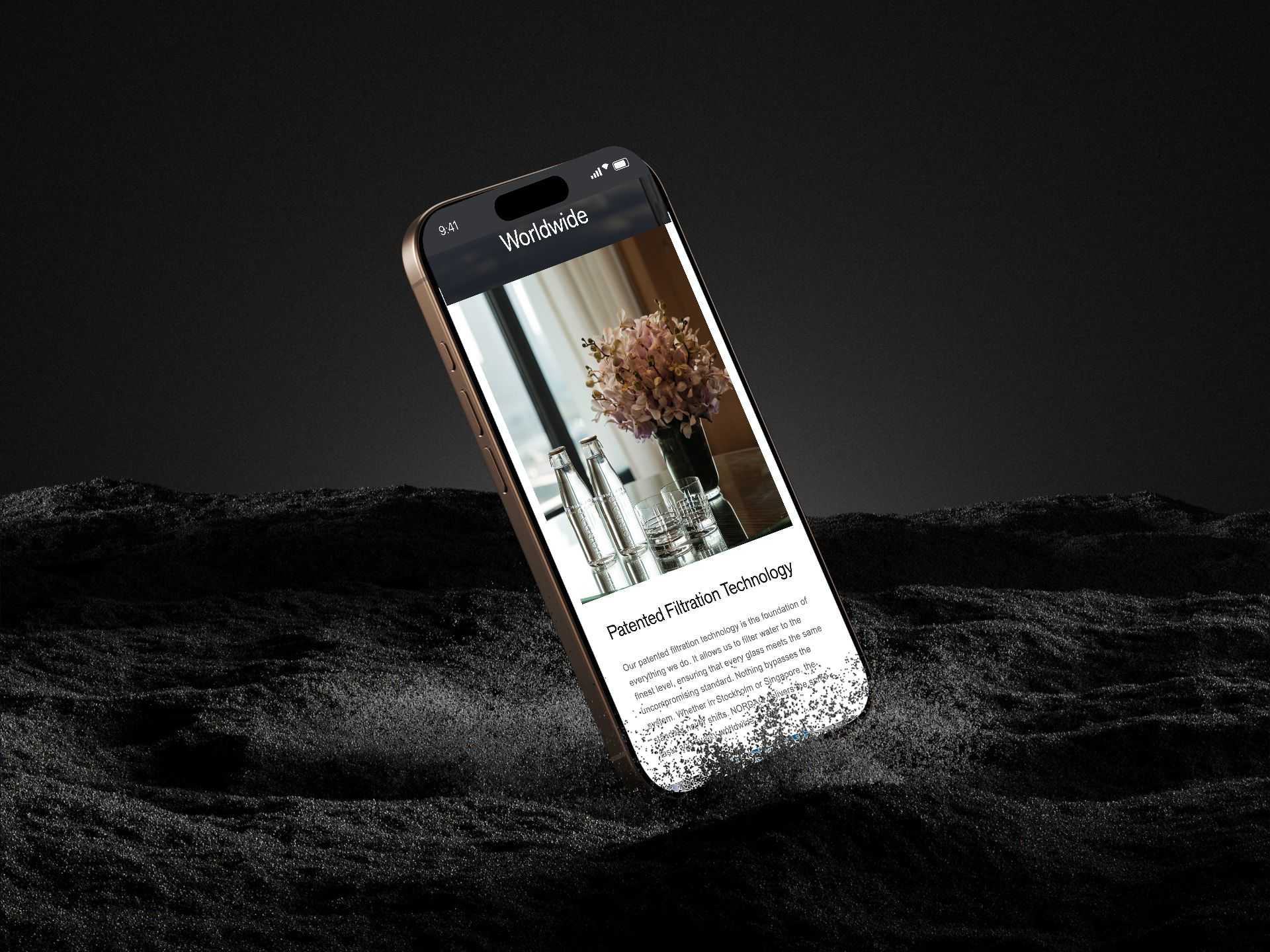
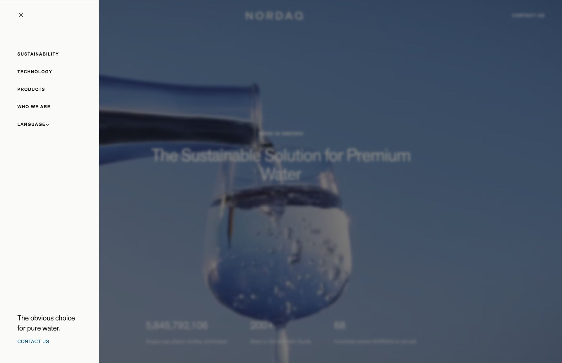
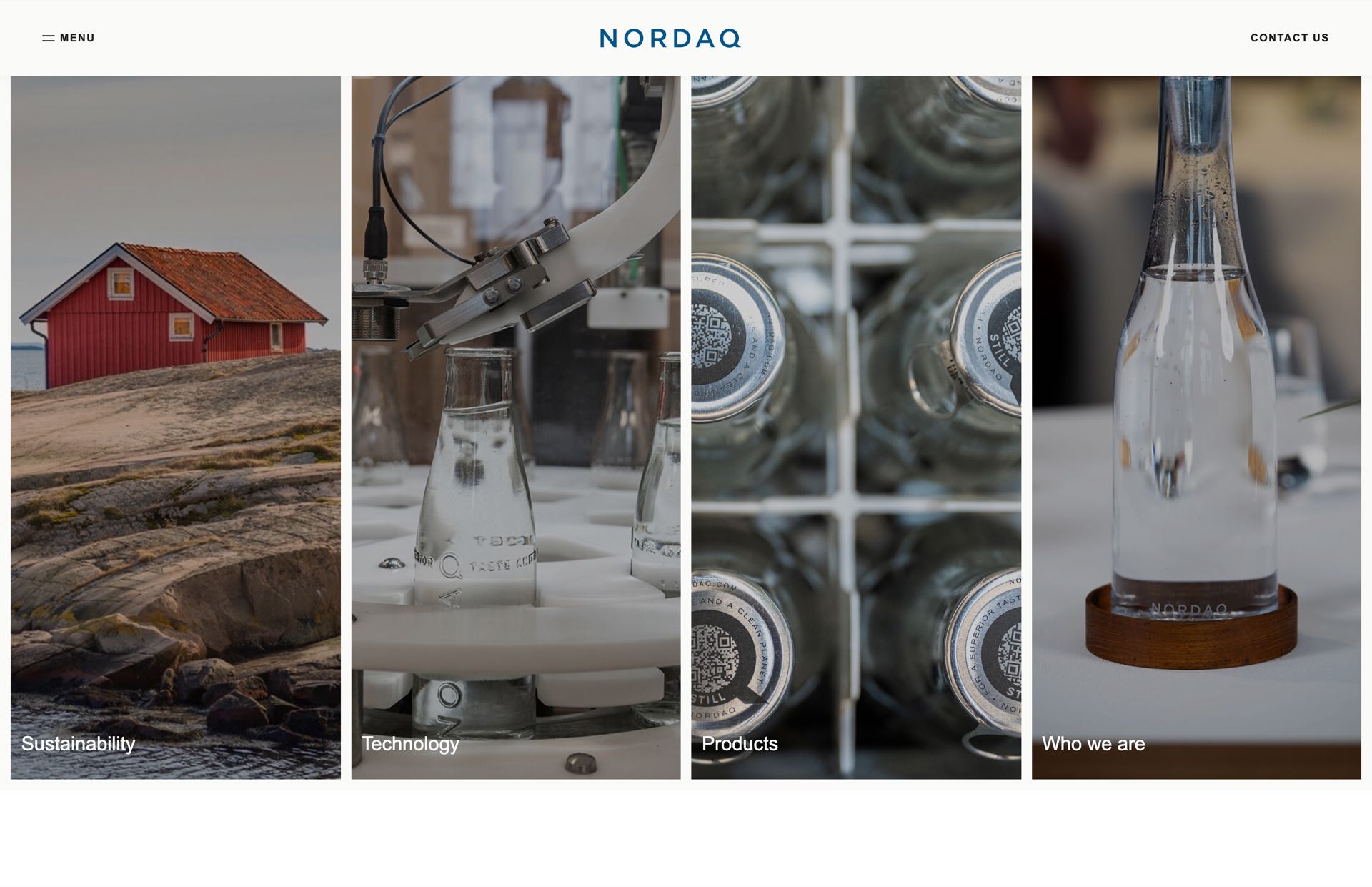
Home, About, Sustainability, Technology, Products and the bottle and system pages run on the new design, with a new menu and footer across the whole site.
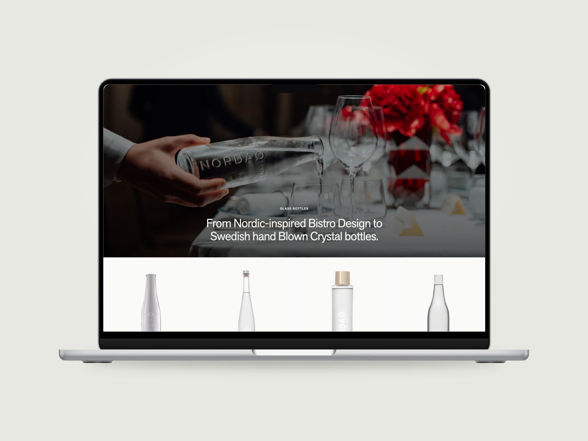
Bottles you can almost touch.
The product pages lead with the pour and the glass, then the caps and the details.
Hand blown crystal should look like it costs what it costs.
Point up and down
Contact us, always in reach.
A water system is sold in a conversation, not a cart.
So the header steps aside as you scroll, and one button stays at the bottom of every page: Contact us.
Whichever page a buyer is on when they are ready, the next step is already there.